The power of the Web is in its universality. Access by everyone regardless of disability is an essential aspect.
Tim Berners-Lee, W3C Director and inventor of the World Wide Web Tweet
WordPress Accessible Website Design
Find out how you can improve online accessibility with our WordPress Accessible Website Design top 10 tips.
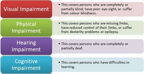
Everyone is different. In the online world, how we see, move, hear and think can vary greatly. People may use websites in many different ways. Accessibility is essential to some but useful for everyone.
What does accessible website design mean?
An accessible website design means the site is accessible to everyone including people with a diverse range of hearing, movement, sight and cognitive ability.
Web Accessibility Initiative (WAI) leads the global web guidelines for accessibility (Accessibility). The UN also recognises the importance of access to information which includes the web. The aim is to improve digital accessibility across all websites.
Accessible website design also overlaps other online best practices such as web design, usability, and search engine optimisation (SEO). Research shows that accessible websites rank higher in search results and increase audience reached.
Create an environment that is friendly to 100% of its visitors, users, and customers. The website allows all content to be read, all visuals can be seen and all media can be viewed.
You want people with disabilities to acquire the same information, participate in the same activities and actively produce content in the same ways as other users.
The Sydney Morning Herald article ‘Bruce Maguire still fighting to make websites accessible to people with disabilities‘ states:
- According to the Web Accessibility Initiative, most websites have accessibility barriers that make it difficult or impossible for many people with disabilities to use the web.
- Although the Human Rights Commission doesn’t publish numbers on exactly how many websites have been complained about, its annual report says it received 830 complaints concerning disability discrimination during the 2013-14 financial year.
- About 39 per cent of those complaints were related to discrimination in the provision of “goods, services and facilities”, which includes websites.
This video by W3C Accessibility Initiative (WAI) is a great overview of accessible website design:
- 4 Basic Principles of Accessibility
Based on user experience, the 4 basic principles of web accessibility content is that content must be:
- Perceivable – How you perceive information
- Operable – Interact with the content
- Understandable – Clear instructions of where you are and what the content is about
- Robust – Flexible to be rendered on multiple devices including assisted technologies
What are the common barriers of accessible website design?
Some of the common accessibility barriers when creating or using a website include:
- Structure
- Reading order
- Keyboard
- Text alternatives
- Colour and contrast
- Link text
- Multi-media
Try to Experience Digital Accessibility First-Hand
Take some time today (1 hour if you can) to experience the impact of digital accessibility or the lack of accessibility online.
How can you do this?
- Go Mouseless for 1 hour – unplug/turn off your mouse and only use your keyboard to navigate online websites. Use Tab/Shift-Tab, arrow keys, enter and spacebars to try to navigate.
- Enlarge your fonts. To do this, resize the text to 200% and look at the screen and see if there is any loss of content or functionality.
- Browse the web with a screen reader – you can try PC – NonVisual Desktop Access (NVDA) or MAC – VoiceOver
This will give a little insight into how to apply accessibility to your website. You can spot what doesn’t work well using those methods above to help improve your website accessibility.
View more great tips on the Global Accessibility Awareness Day website.
Australian Disability Demographics:
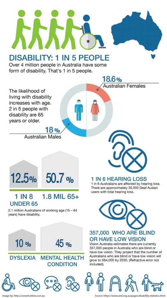
Souce from Australian Network Disability. View more disability statistics here.
How can you optimise your site for accessibility?
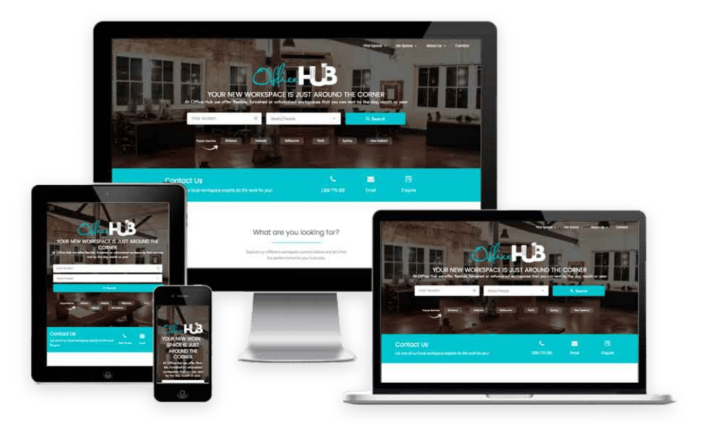
Most websites today are built with mobile in mind. It’s important to allow your website to be responsive so the information is accessible on all devices including mobiles and tablets. If your website is not responsive now is the time to make it responsive for many reasons. Responsive websites are more accessible on different devices and screen sizes. Google also loves responsive websites and will rank those that are mobile friendly higher than websites that aren’t.
2. Text Resizing
The text on your website might not be very visible to some users. You can add text resizing plugins to your website to allow visitors to select their preferred text size to display on your website.
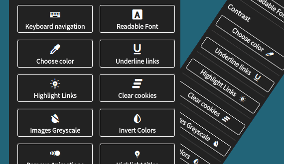
A great plugin for WordPress is WP Accessibility Helper. This plugin allows you to add a little icon on your site for users to be able to customise the look of the site to suit their accessibility needs. Some of the functionality that this plugin can help you with is:
- Contrast & colour variations
- Font resize
- Remove styles and animations
- Underline and highlight links
- Focus user’s attention on content with Lights Off mode
- Dark & light sidebar themes
3. Alternative Text
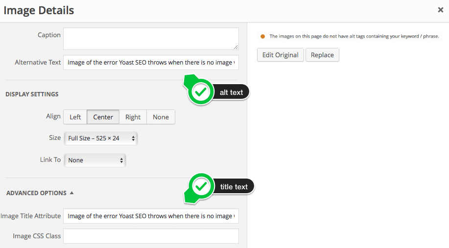
Some visitors might not be able to see images on your website. You can use alt text and captions to describe the image. This way if they can’t see the image, they can understand what you are showing on your website.
Make sure that the alternative text means something to the user. For example, if you are comparing a car vs a bike usability, then you will need to identify which images belong to the car and which images belong to the bike. This gets hard when you are trying to describe charts and graphs. You can use Alt Tags on links, images, buttons etc.
4. Transcripts
Videos and podcasts are very popular on websites. For those who are not able to hear, they will find it difficult to view your videos or listen to your podcasts. Creating transcripts or subtitles on videos will allow visitors to understand your key messages.
5. Content Structure
Break up your content with clear title headings on every page with subheadings breaking up the content. When using headings use different header labels such as H2 for your main heading and H3 for subheadings. The page titles should clearly indicate what that page is about.
Use lists to group information together such as ordered lists for sequential information. This will help make your content more readable and easier to digest.
How does content structure help? It allows visitors to:
- Prioritise content on the page
- People using screen readers can skip to the main content directly and navigate to sections that are important to them
- Keyboard users can browse pages and their sections more efficiently.
- Helps provide visual cues for people with low vision
6. Colour Contrast
Colour is very important for accessibility especially when it comes to text colour contrast. This includes all titles, body copy, copy on a solid background, links, captions etc.
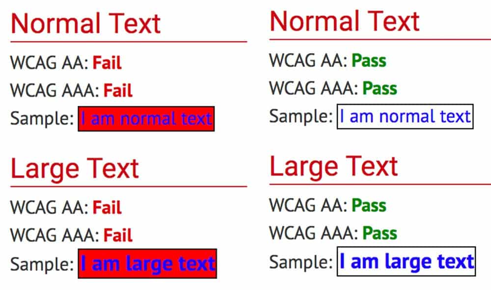
High contrast colour between the background and the text colour allows the content to be more accessible. It also depends on the colour you choose for the text as visitors who are colour blind might have trouble viewing the text.
W3C has set standards on colour contrast against a background to 4.5 to 1 or higher. You can test the colour contrast here: Contrast Checker
You have 3 different levels:
Level A – the lowest level
Level AA – requires a contrast ratio of 4.5:1 for normal text and 3:1 for large text.
Level AAA – requires a contrast ratio of 7:1 for normal text and 4.5:1 for large text. Large text is defined as 14(bold)-18 point font or larger. “Note that even content that conforms at the highest level (AAA) will not be accessible to individuals with all types, degrees, or combinations of disability, particularly in the cognitive language and learning areas.“
Find out more about the different Accessibility levels here.
Colour can be hard to get right as there are many factors that determine the colour of the text including brand colours, psychological and emotional implications, and accessibility.
Another useful too is the Colour Blindness Simulator
7. Call to action / Directional Cues – Buttons and Links
Make call to actions clear. Buttons should be clear that they are buttons to click on to take action, or if you want them to go somewhere look at adding directional cues such as arrows to help guide them around your site.
8. Clear navigation
Clear navigation is helpful for everyone. Your navigation should be easy to understand, clear and easy to follow. Make it easy for visitors to get to where they want to go. Keep your navigation title short and simple.

9. Voice Search & Text to Speech
Allow visitors to search for content on your site. Have a search icon or search bar in your navigation allowing visitors to easily find content. You will also see a big trend towards voice search capabilities.
10. Images
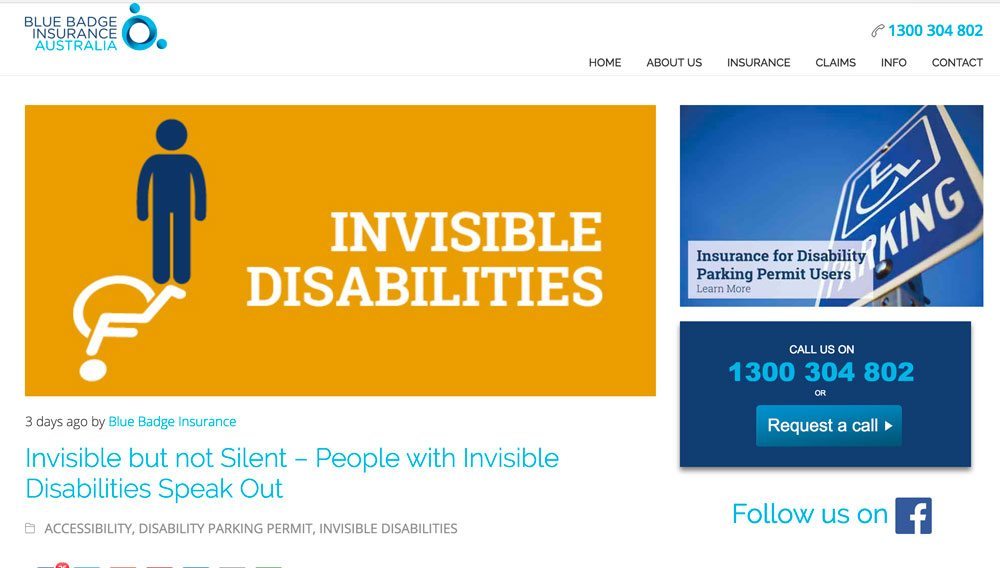
Images and graphics are a way to split up content on a screen to make it more readable. It also helps visitors understand the content on the page better, in particular for those with cognitive and learning disabilities. Images can also be barriers if they are not accessible.
Making images accessible will help people using screen readers, speech input software, speech-enabled websites, mobile web users and SEO (images become indexable by search engines).
A sample of different images…
Informative images:
These images can be icons such as phone or email icon. This acts as a visual cue for a phone number as well as the alternative text can be ‘Phone’ or ‘Telephone’ which can be used by screen readers for searching for a phone number.

General images:
Can be used to show emotion, convey information,
File format icons
If you add documents to a site, you can use format icons in the text links to show what file format that document is, such as ‘Word Document’ and ‘PDF’.

Charts and graphs
Charts, graphs or informational diagrams can be used to visually explain the information in the content.
With all images, it’s important to add ALT TEXT.
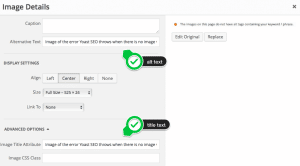
In WordPress it is very easy to add alt text to all images. This allows screen readers and search engines to read the image.
How can you check the accessibility of your website?
A quick way to check the accessibility of your website is to use the Easy Checks from W3C tool.
With these tools you will go through a step by step test. It will get you familiar with the issues on your site and what you need to improve to make your website more accessible. Further down is a list of plugins, tools and resources to find out more about website accessibility.
WordPress Accessibility Plugins
There are some great plugins you can use to help improve your WordPress Accessibility.
This is a great plugin which allows you to:
- Enable skip links
- Add language and text direction
- Add a focus outline
- Toggle high contrast and large font stylesheets
- Enforcement of alt tag attributes (great if you keep forgetting to add them!)
- Easy font resizing buttons
- All visits to highlight or underline links
- And much more.
If your website is in WordPress, you can check the accessibility of a web page in the back end with a plugin such as Accessibility Checker by Equalize Digital. This plugin makes it very easy to understand issues and how to fix them. It also has an easy-to-read and easy-to-understand interface.
The plugin is available in free and paid versions.
Get Accessibility Checker Pro.
Other useful plugins:
- WP Accessibility Helper – great plugin! Easy to use and easy to install.
- Contact Form 7: Accessible defaults— generates accessible contact form defaults in Contact Form 7.
- Gravity Forms WCAG 2.0 Form Fields– Fixes accessibility issues in Gravity Forms
- Access Monitor– Uses Tenon.io to scan your site for accessibility issues
- Genesis Accessible– Fixes accessibility issues with Genesis
- WP Accessible Twitter Feed– Provides a minimal Twitter feed for easier accessibility
- Screen Reader Text Support– Adds instant support for the core .screen-reader-text class to your theme.
- Accessibility Widget— add a sidebar widget to change text size in your site.
- Zoom— enable site visitors to resize the predefined areas of your site.
Tools to evaluate your website accessibility
Web accessibility evaluation tools list
WAVE Web Accessibility Evaluation Tools
Colour Contrast Analyser for Mac and PC
Chrome plugin for visual impairments
Extra resources to learn more about W3C Accessibility:
- Introduction to Web Accessibility
- Essential Components of Web Accessibility
- How People with Disabilities Use the Web
- Improving the Accessibility of Your Web Site
- Web content accessibility guidelines (WCAG) overview
- Understanding WCAG 2.0
- Essential components of web accessibility
- Web Accessibility Frist Aid: Approaches for interim repairs
- Web Accessibility Tutorials
- Web Accessibility Perspectives
- Accessibility Toolkit by Vision Australia
- Online Course: WordPress Accessibility
Website Accessibility with Eric Dingler:
This video and podcast is a great overview of what you can do to your website to make it more accessible:
