Design better buttons with these simple tips
Buttons are an essential element for your website interaction design. There are different types of buttons and different ways of using them. Learning the basic principles will help create effective buttons for your website.
Follow these simple tips to create better buttons on your website and improve your user experience.
What are the different types of buttons?
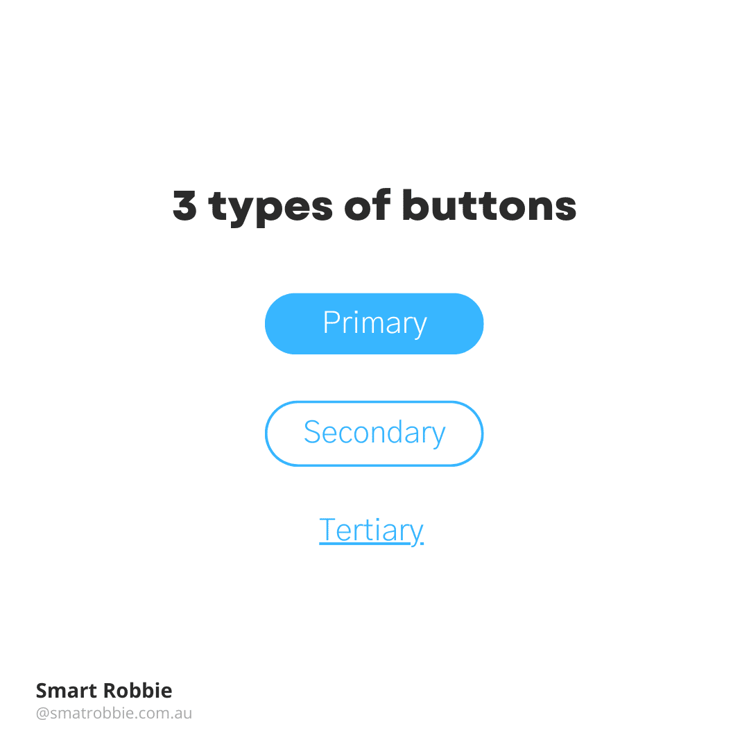
There are 3 main types of buttons that are used on websites for different levels of hierarchy.
- Primary Button
- Secondary Button
- Tertiary Button
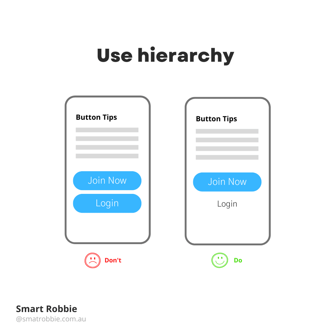
Order and hierarchy of your buttons
The order of your buttons should reflect the actions you want your user to take. When creating a button ask yourself what would your user be doing right now on the page. For example, if you are on a signup page, you want the user to click Join now instead of the login page.
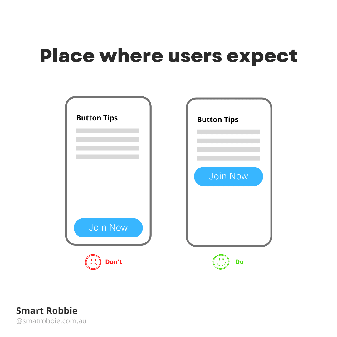
Put buttons where users expect to find them
Buttons should be located in places where you naturally expect to find them. Don’t make your users hunt for buttons.
Review your page or ask friends to have a look at the page and ask them if it’s clear what you want the viewer to do.
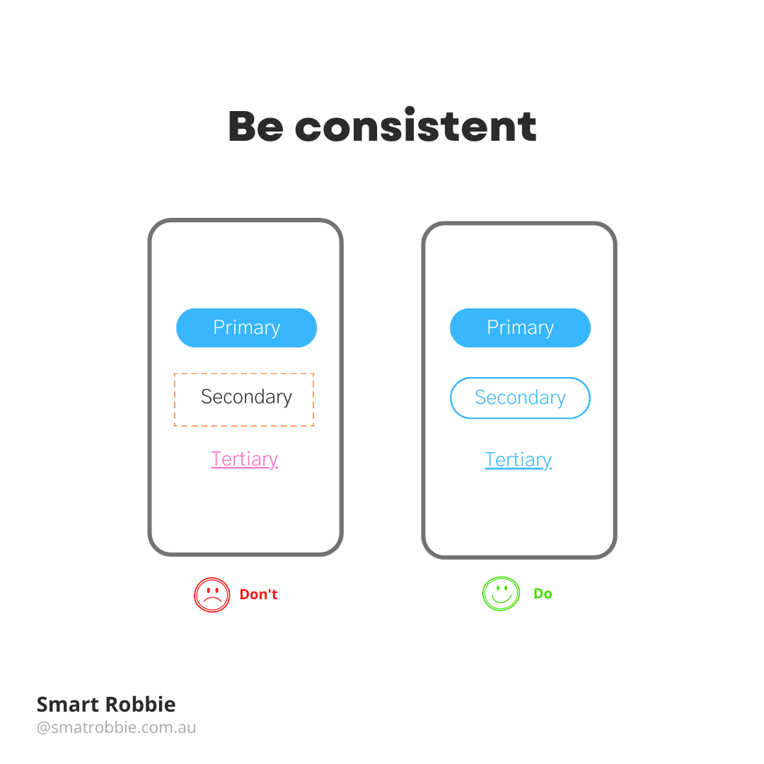
- Be consistent with your button styling
What not to do with your button styling:
- Don’t make some square borders and others rounded borders
- Don’t make some Purple buttons and others Brown. Be consistent and make all your primary buttons the same colour.
Ideally make all your button styles the same throughout the site. For example:
- All primary buttons solid with rounded corners
- All secondary buttons ghost style with rounded corners – you can use the solid colour as a hover style.
- Text links can be the same colour as your button colours.
Creating all clickable elements the same colour will help your user understand what elements are clickable and which are not.
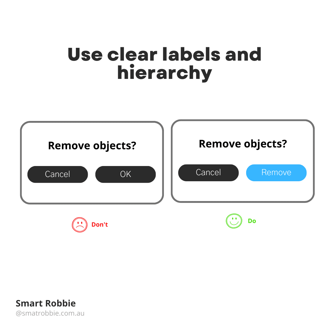
Label buttons with what they do
Generic buttons don’t tell the user what they will be doing next and can often be misleading. This can cause frustration for your users. Write button labels that clearly explain what each button does, it should describe its action.
By using clear labels, the user can understand what will happen next when they click on a button. For example if you want to delete a file, you don’t want the button to say “OK” and “Cancel”. OK doesn’t say much about what the action does. Instead of using OK use “Delete” or “Remove” and also change the colour of that button. This makes it clear what the button will do for the user.
Make buttons look like buttons
It’s important to make your user experience natural. you don’t want to make people think hard and try to work out how to navigate your site. Users need to know instantly what elements of the site are clickable and which are not.
User Interface is all about making the website easy to use and reducing the efforts to decode the design. Visual signals that are weak and not clear require effort for the user and they may not notice these visual signs.
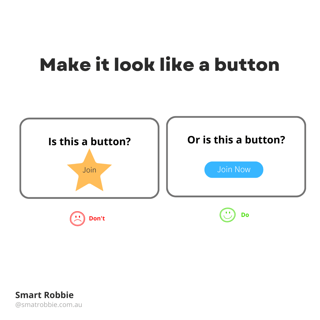
It’s important to use visual signals such as size, shape, colour, shadow etc to make elements look like buttons.
Use familiar designs for your buts, don’t make them look like a star object or a random object. Make them look like actual buttons, for example:
- Filled buttons with square borders
- Filled buttons with rounded corners
- Filled buttons with shadows
- Ghost buttons
Don’t forget to create white space around your buttons so they are easy to see and click on.
Size of your buttons
Make important buttons look more important than your other call to actions. You can do this by making primary buttons solid and secondary buttons ghost buttons.
Make buttons mobile friendly
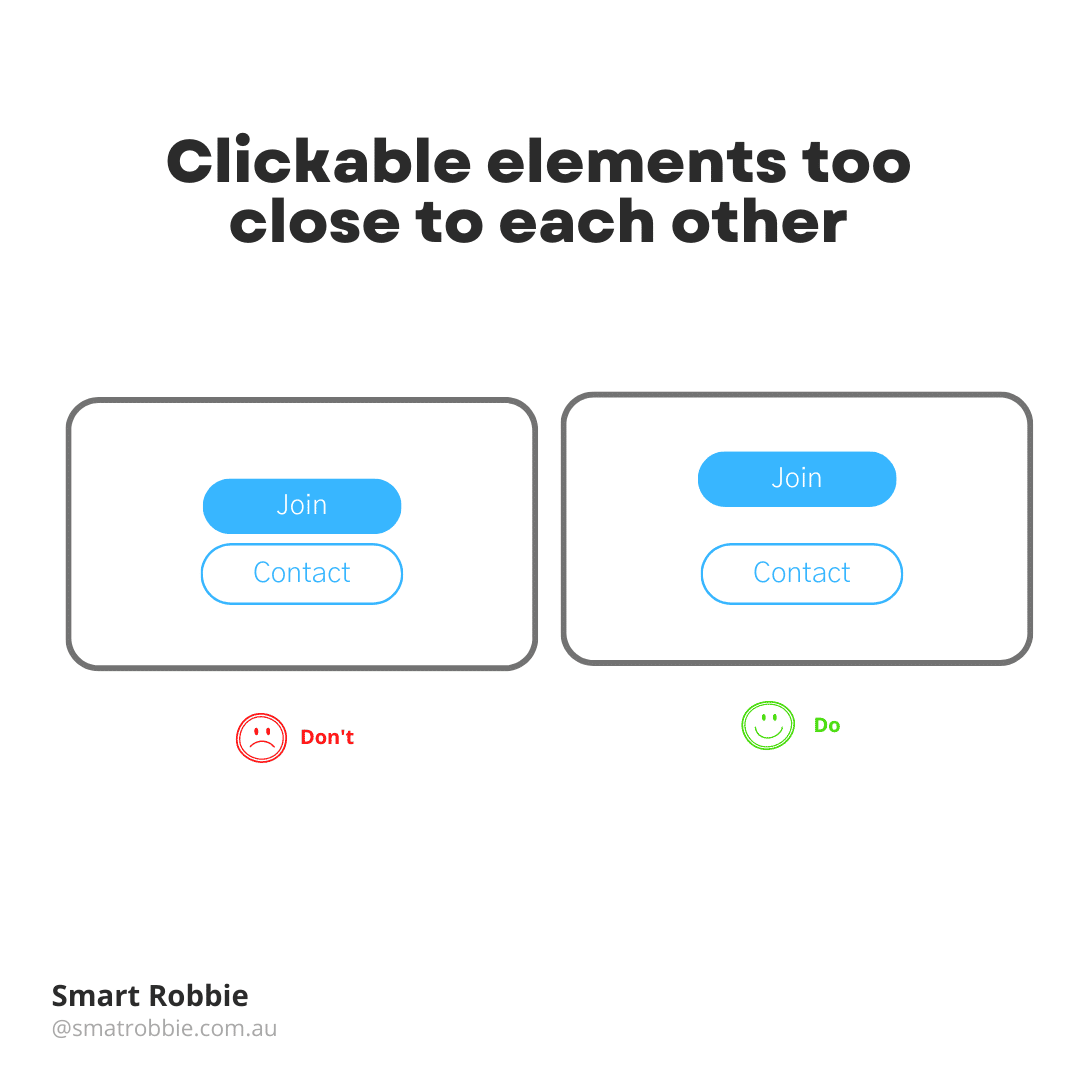
You may have got a notification from Google Search console saying that clickable elements are too close to each other.
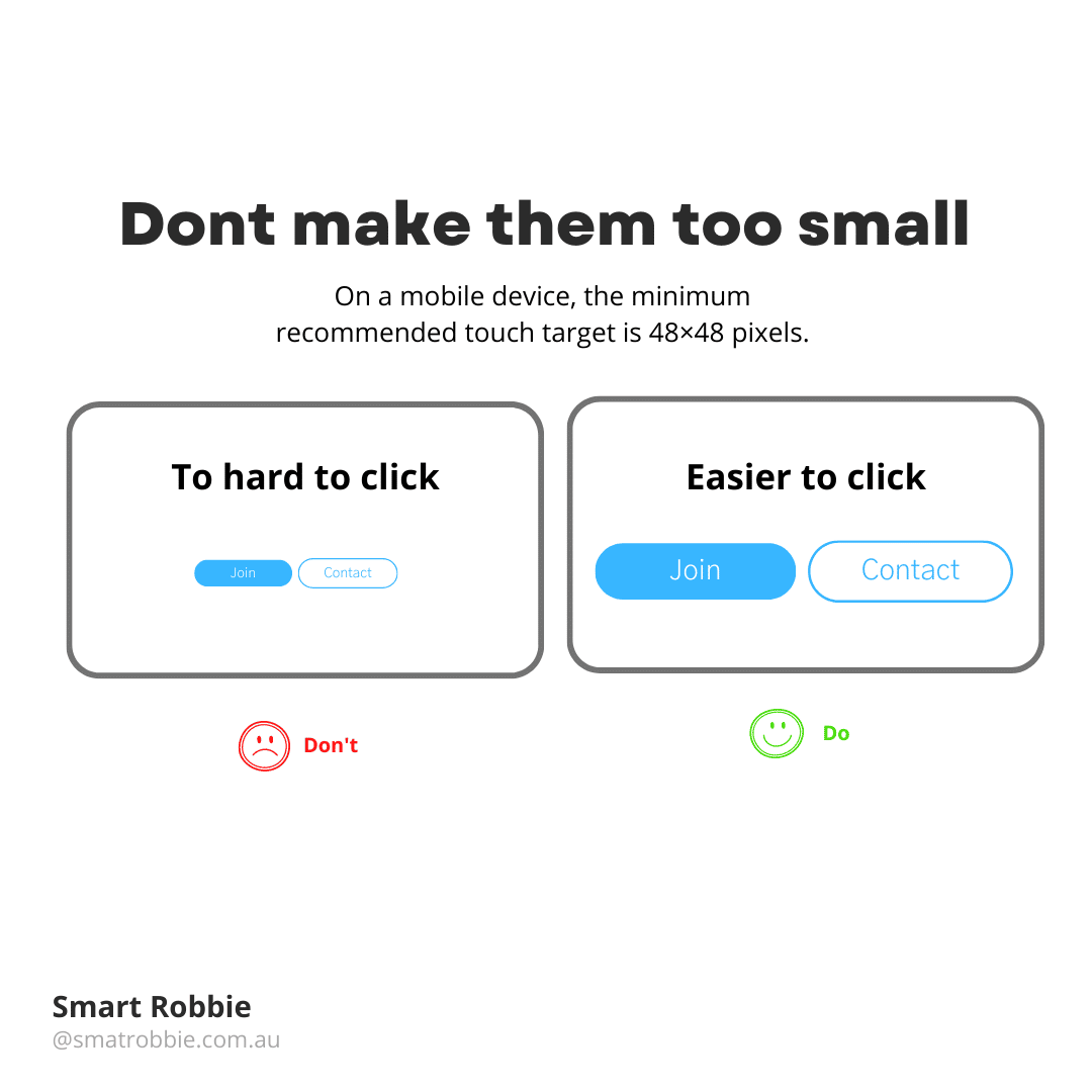
It’s important to make buttons mobile friendly. Making buttons too small often leads to the users accidentally clicking on the wrong button and feeling frustrated.
Studies have found that the average finger pad is around 10-14mm. This makes a minimum touch point of 10mm x 10mm.
On mobile devices, the minimum recommended touch target is 48×48 pixels.
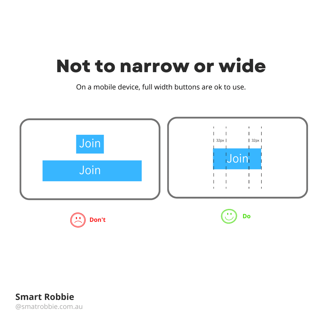
When creating a button try to make sure the button is not to narrow or wide. Create even spacing around the button. The sides of the button should be the same pixel width as each other and the top and bottom padding should also be consistent. On mobile devices, it’s ok to use full width buttons.
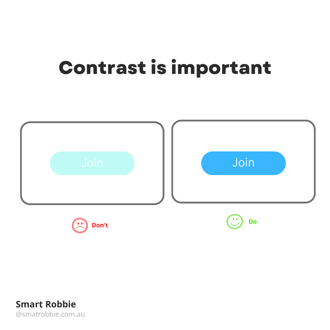
Contrast is important for accessibility
Contrast is important for accessibility. If a user isn’t able to read the button or event see if there is a button there, they won’t be able to click on it. It’s important to understand that a good contrast between text colour and background colour helps with making your website more accessible to all users.
Avoid using too many buttons
Try not to use too many buttons. This will not help the user decide what to do next and they may end up doing nothing and leave the site. Priortise the buttons for your main call to action.
Simply use these tips above to improve your user experience and conversion rates.
