Website text link best practices for SEO and Website usability
Why is ‘click here’ a bad practice for your website?
It’s become very common for people to use links such as ‘click here’, ‘read more’ on their website or even emails and other areas of the web. But why is it not recommended to use these words in your links?
In this article we will cover off some best practices on how you can design better links on your website.
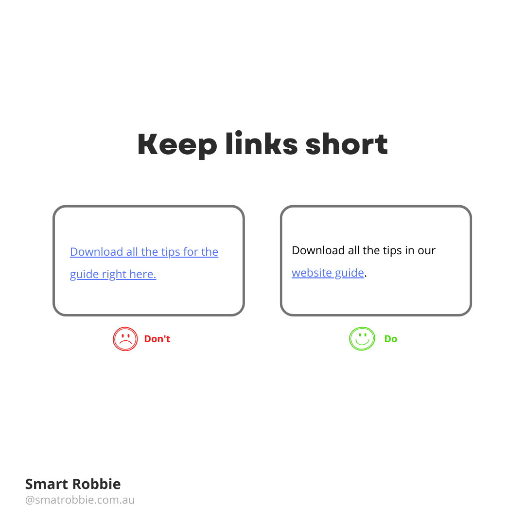
Make your links meaningful
A link, also known as a hyperlink, is a clickable element on the page that links to another page.
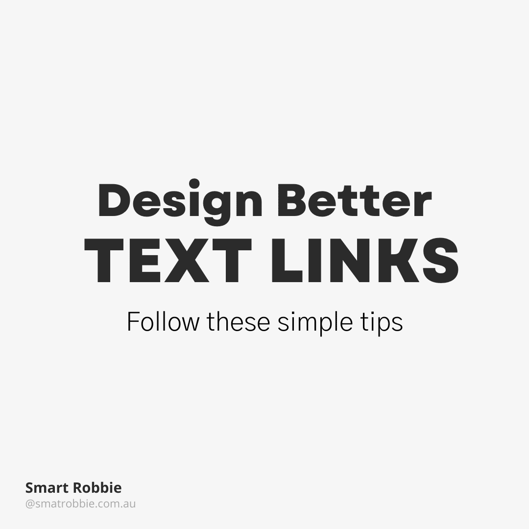
The best practice for Accessibility and SEO is to make these links clear as well as obvious where the link will be taking you. You don’t want to confuse your readers and take them to a page they were not expecting to go to. For example, is it clear that they are going to another article, a web form, a PDF.
For example, instead of writing:
Fill out the form here.
Try this instead:
Fill out our website quote request form.
This also helps with accessibility, especially for those using website screen readers.
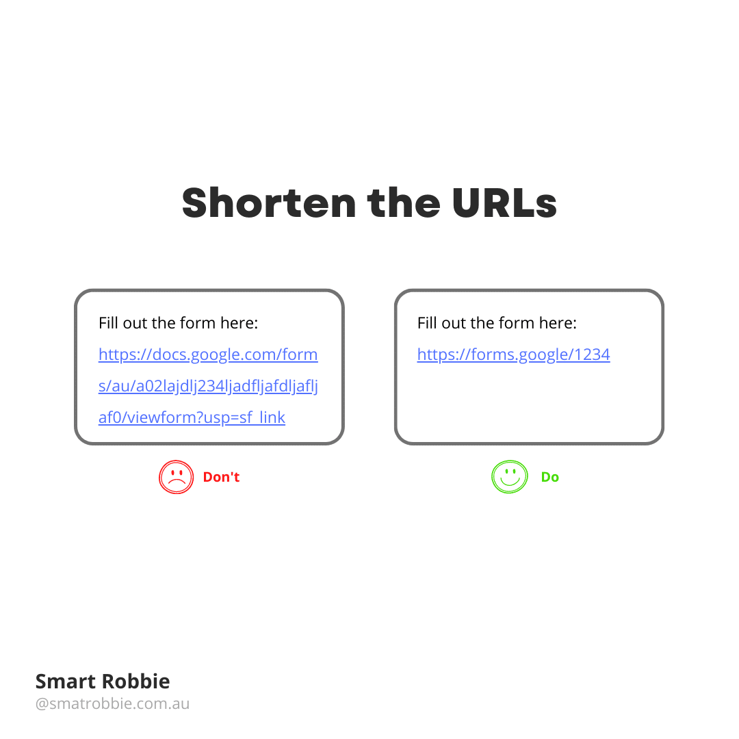
Shorten your URLs
Avoid pasting long unreadable URL links. Instead, consider either creating a meaningful text link or consider shortening your URLs using tools like Bitly.
If you do replace the URLs with a Bitly short link, consider replacing the default characters with something more meaningful or informative. For example instead of using bit.ly/245qed34 you can change your URL to be more readable for example bit.ly/website-link-design.
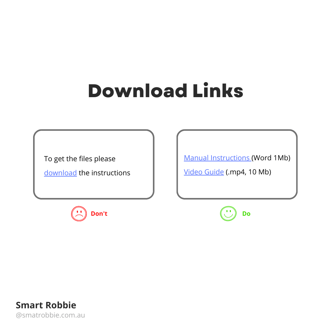
- Designing Download links
You will most likely have links on your website to downloadable PDFs or documents. These links should be treated slightly differently. You should inform the reader about the file format and size.
- File format will give your reader a clue about what they are going to be downloading
- File size will allow users to understand how big the file is that they are downloading. If they are on a slow internet speed or a capped download limit, they may choose to download the file at another time.
This information isn’t part of the hyperlink as you can see by the visual example, instead sits next to the link informing the user of what they are about to download. Being specific with the link structure can help people who are blind using a screen reader.
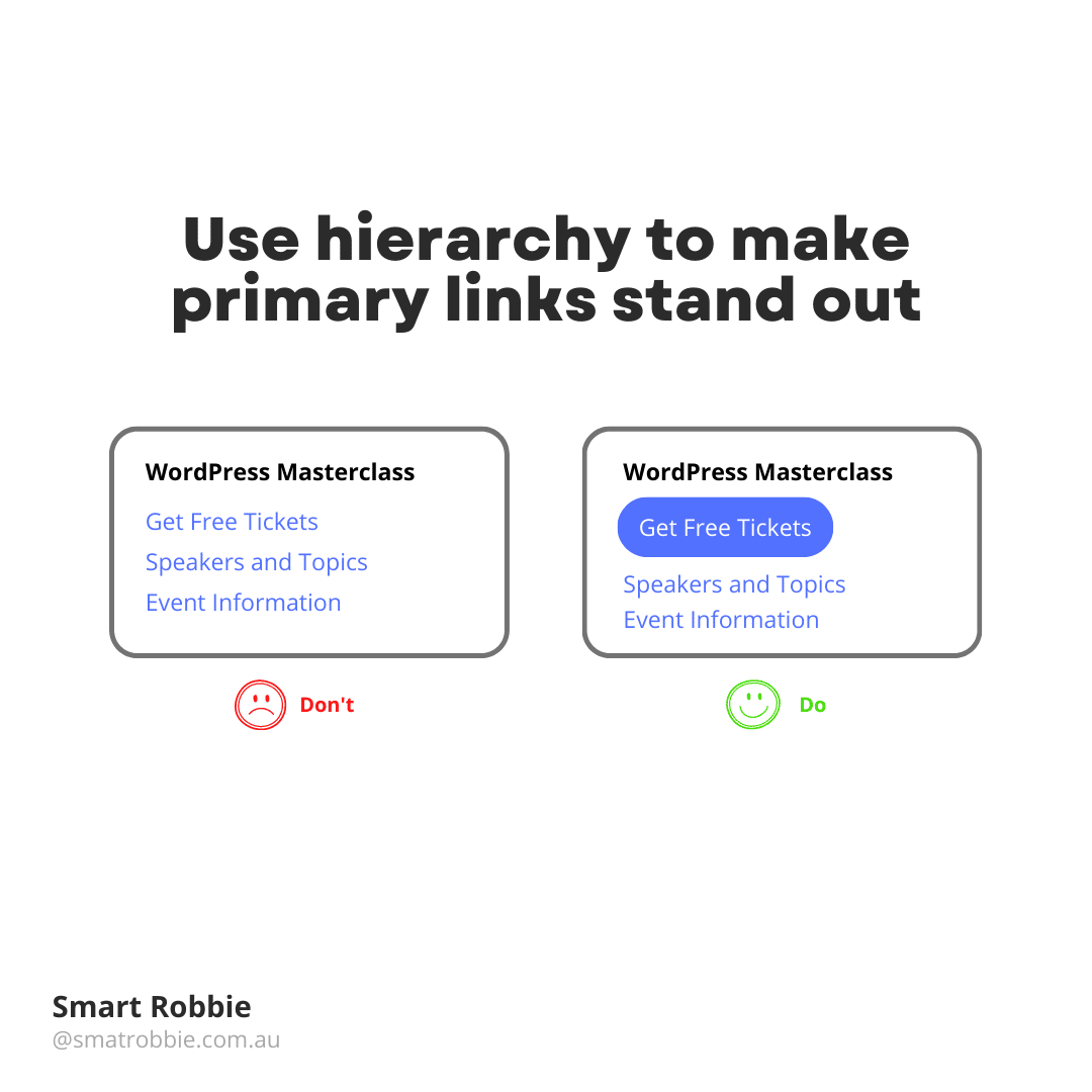
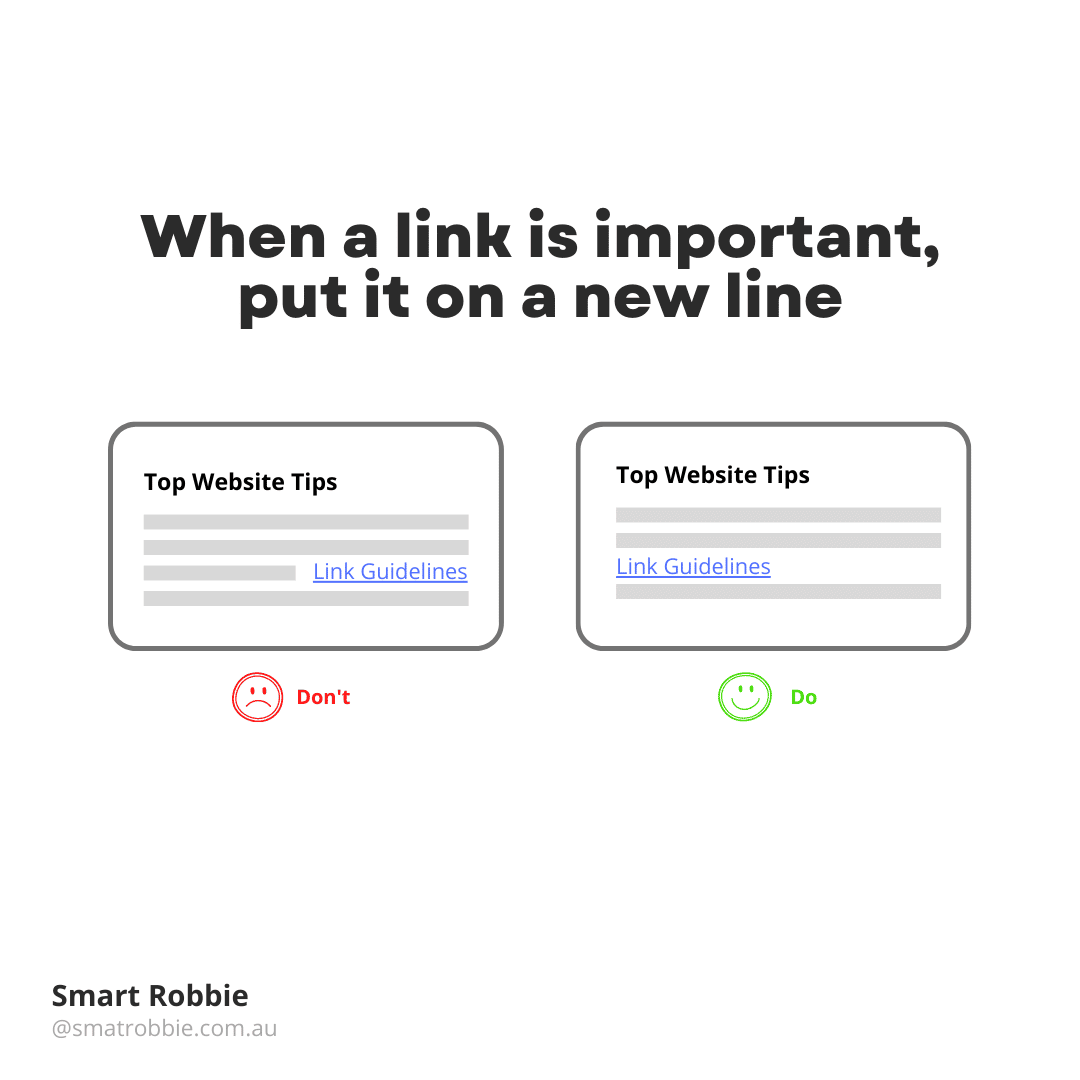
Use different style links to help make your primary links stand out
For example, if you are selling tickets to a show, your main primary link may be to Buy Tickets instead of an information link.
You may consider creating a button instead of text link to prioritise your call to action links.
If you don’t want to add a button, try adding your text link on its own line and make it bold.
Button’s should have the following guides applied:
- Be concise – use up to 4 or 5 words
- Start with a verb e.g. get, buy, download, apply
- Name the action for what the outcome will be
For example, if you say ‘Download the whitepaper’ the user will assume as soon as you click on the button, the download will start. If you use the words ‘Get the whitepaper’ the user will assume there will be a form to enter with your email and name to get the white paper.
Link Accessibility
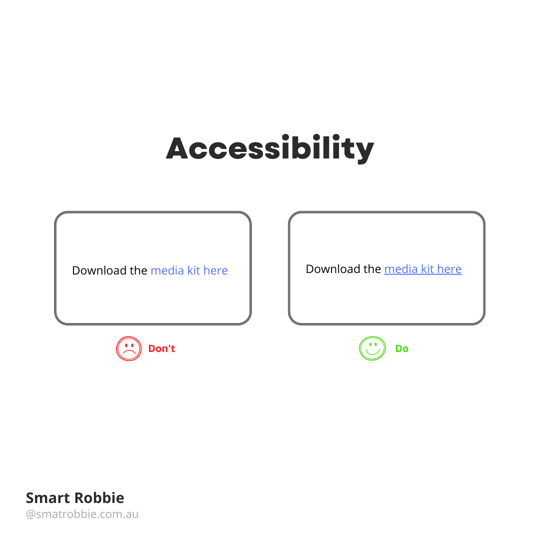
Links are one way to make your site more accessible. WCAG (Web Content Accessibility Guidelines) provides recommendations on how to make hyperlinks more accessible.
WCAG helps to put in rules around links so that it’s clear what part of the copy on a website is a link compared to the rest of the content. One of the common ways to identify links is to make links a different colour to your body copy, for example, blue.
You can make your website links more accessible by doing more than just changing the colour of the link. Other ways to make them clear is by underlining links and making them bold. Links should differ from the rest of the copy by using at least 2 options e.g. different colour/bold or different colour/underline.
Colour Contrast Links
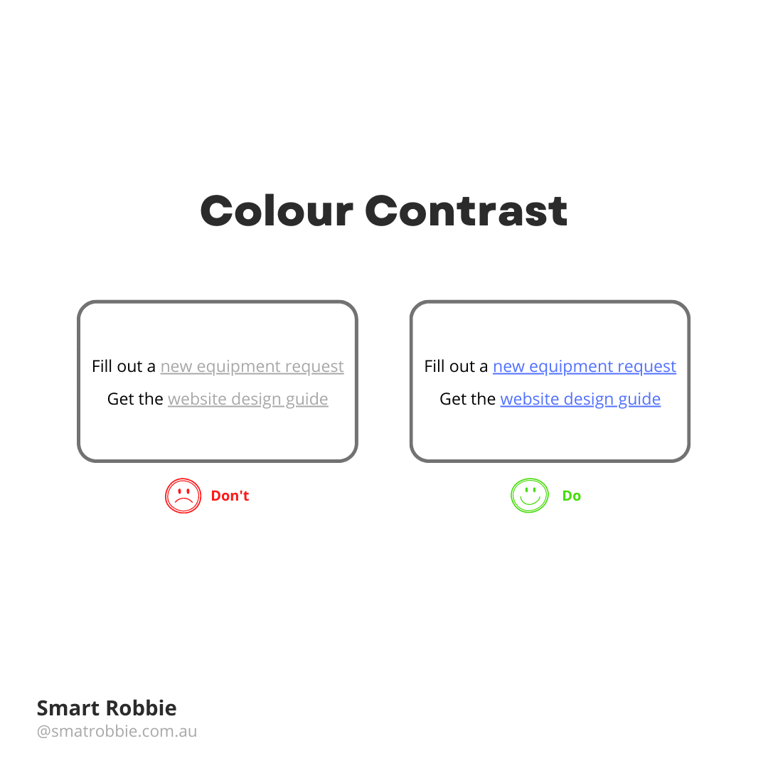
Another way to make links more accessible is by colour contrast. There are times when you visit a website and the links are a light grey, or the colour is so light you can’t read the text.
WCAG has 2 levels of contrast in order to meet compliance: AA – medium – used by the majority of websites, AAA – high, primarily used for government websites or websites who’s target audience is people with disabilities.
Design Better Hyperlinks
Use these tips above to help improve the accessibility of your website. By making links more accessible and readable, you are also improving your customer user experience and SEO optimisation.
