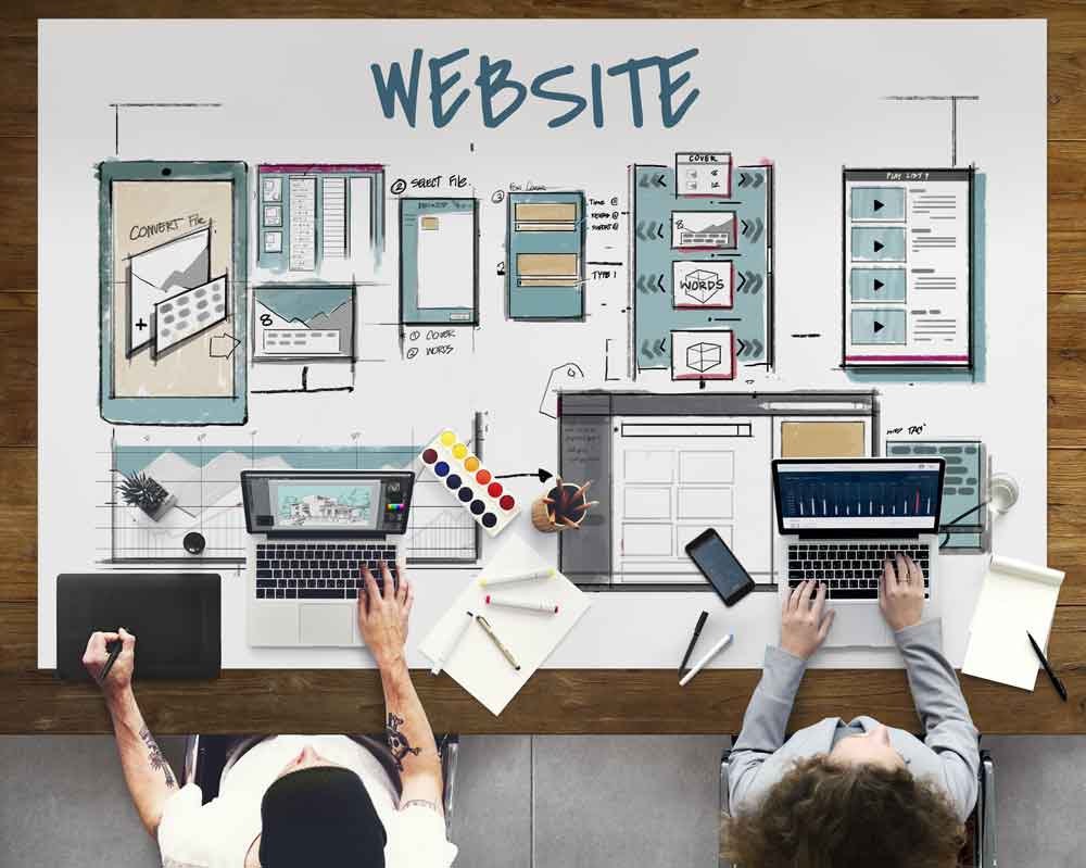
Here are 6 quick tips to improve your website today
-
Keep things fast
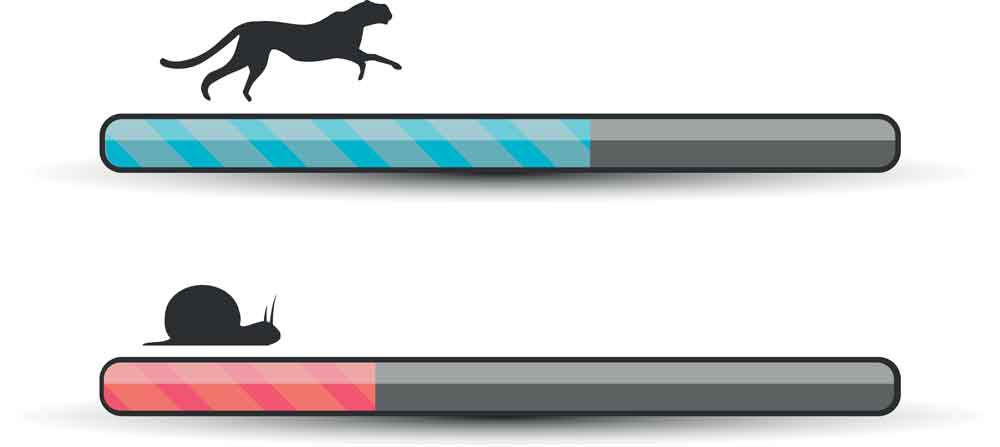
As technology advances, people expect to get instant access. It’s a very frustrating experience waiting for a page to load. This is one reason why your website page speed (otherwise described as ‘page load time’) should be fast. Many people have found that faster pages both rank and convert better.
For every 1 second delay in page load time can lead to 7% loss in conversions, 11% fewer page views and 16% decrease in customer satisfaction.
Faster websites also see SEO benefits. Google has indicated site speed is one of the factors in its algorithm to rank pages. Google has already started penalizing slower websites by pushing them down in the search results. Additionally, a slow website means Google and other search engines will crawl fewer pages which could affect your website visibility.
Page speed plays an important role in user experience. The longer a page takes to load, the higher chance the user will leave your site which will reduce your conversion rate.
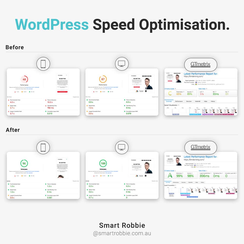
To find out what your website load time is, you can enter your website url into these 2 free online tools:
These speed test tools will also give you other suggestions on how to improve your website load time.
What is the ideal load time for a website:
Ideally you would like to have your website load in less than 1.5 seconds, however, the acceptable range is between 1.5 and 5 seconds. Your first goal is to get your website load time between 1.5 – 5 seconds.
Here are a few quick tips on how you can improve your website speed:
- Contact your hosting provider to see if there is anything they can do to improve server response time.
- Optimise your images – large file sizes will slow your website down. For example, a 1MB file will take 200 times longer to load than a 10kb file. This will depend on your internet speed. For those who have slower internet connection, a 1
MB file will take 4 seconds to load. From a visitor user experience, if your home page has 5 x 1MB images, a visitor on a slow internet connection will experience a 20-second wait for the page to load. Your aim is to get files under 50kb if possible (or at least under 100kb). The best tool to use is Photoshop if you have it or you can try an online tool to reduce your image file size is Tinypng.
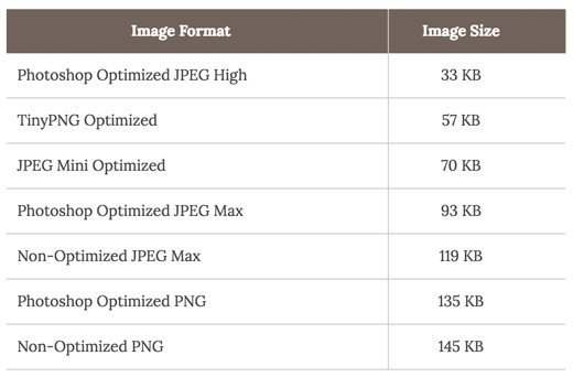
Below is a comparison chart of the file sizes and different compression tools that can be used. As you can see in the chart, the image format you use can make a HUGE difference on your website performance.
- Leverage browser caching. Caching stores data in your web browser cache. This is a temporary storage area which allows you to view websites faster. For WordPress users, you can easily do this with a plugin. Our recommendations are: WP Super Cache or WP Fasted Cache. These plugins will cache the website for you and do more advanced speed optimisation such as Minify CSS, JacaScrip and HTML
For those who are using WordPress, here is an ultimate guide to boosting WordPress Speed and performance: WPBegginer Blog,
-
Clear message and call to action
You have three seconds to grab the visitor’s attention. Make your content clear and consistent. Don’t try to pack your homepage with as much information as possible as users won’t read it.
Have a clear unique selling proposition. Think about your potential customers and what they are looking for. What are their beliefs, desires, and fears? Customers often use emotional or rational thoughts when deciding to purchase. Having a better understanding of your customers can create better messaging and calls to action.
When you create calls to action, use clear visual cues. Calls to action that are clear and contain an active word such as… will allow your customers to act or navigate your site easier.
Use your headline to tell visitors what the site has to offer, keep it clear and simple.
Use subheadings to describe the header in more detail e.g. what you do or what your offer is.
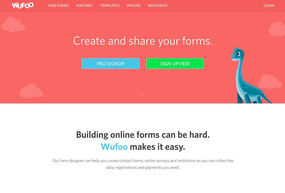
A great example is Wufoo. When you first visit their site, it’s clear that this site is about creating online forms. They have clear call to action buttons “PRO SIGNUP” and ‘SIGN UP FREE”. They also know their target market and what frustrates them. They describe the customers’ frustrations – ‘Building online forms can be hard’ and they provide a solution that will benefit the customer – ‘Wufoo makes it easy’.
-
Remove rotating homepage sliders
You will start seeing a big trend towards removing homepage sliders. Why? Visitors won’t sit there and watch the different messages rotate. They are considered a distraction and conversation killers.
All websites should have a clear goal and a clear action. You have 3 seconds to leave an impression and clearly, tell the visitor what you want them to do. By having a slider there, you are distracting and confusing them with multiple messages.
Lee Duddelly from What Users Do said sliders are “useless for users and often ‘skipped’ because they look like advertisements” and that “users will ignore” the messages.
Craig Kistler from Signet has done user testing for over 15 years and said “In all the testing I have done, homepage carousels are completely ineffective… In test after test, the first thing the visitor did when coming to the page with a large carousel is scroll right past it and start looking for triggers that will move them forward with their task”.
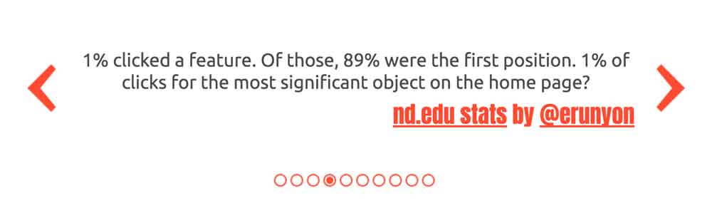
Notre Dame University web developer posted some results on the click-through rate of sliders. The results showed 1% of users clicked through to the next slide and 84% of those clicks were from the first slider that showed.
-
Add a contact phone number to the top right
![]()
If you have a phone number for customers, place it prominently on the top right-hand side of your site.
An easy to find phone number can boost your conversions. Gives visitors a quick call to action for quick answers. You don’t want people hunting around your site to find your contact details if they want to get in touch directly.
This also helps give a human, personal touch to your site and gives the visitors comfort knowing they can contact you.
-
Simplify your navigation

Offering too many navigation options distracts from your goal of maximising your conversions.
As websites grow, the navigation can become complicated. Take some time to review your navigation structure and see if it’s easy for visitors to get where they want to in less than 3 clicks. Visitors shouldn’t have to work hard to get the content they want.
By streamlining your navigation, you will improve your user experience and allow people to get to the content they are after faster.
Another tip for improving your navigation is to simplify the titles. For example, change the following titles:
- About us – change to ‘About’
- Contact us – change to ‘Contact’
- Our Services – change to ‘Services’
- Resource Links – change to ‘Resources’
This keeps your navigation clean and clear.
Feature a maximum of 6-7 top navigation items. Including too many items in your navigation can confuse visitors and they won’t be able to quickly get to the content they are looking for.
Visitors should always be able to return to the homepage by either clicking on ‘Home’ or on your logo.
Try to keep your navigation 1-2 levels. Avoid going to a 3rd level dropdown.
Remember the power of simplicity.
-
Add Social Proof
Social proof is a powerful way of gaining the visitor’s trust. Studies show that 70% of consumers said they look for product reviews before making a purchase. Product reviews are 12 times more trusted than product descriptions.
Types of social proof include testimonials, case studies, expert opinions, social share numbers, social reviews, or other content that helps the audience convert. Thanks to social media, adding social proof is a lot easier than it has been in the past.
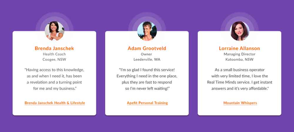
Include a few of your best quotes, keep them short, and showcase them on your homepage. You can use titles to summarise what the testimonial is about.
Add a photo to your testimonials to provide more credibility. You can add photos from LinkedIn profile pictures (always best to ask for permission).
Here are a few quick ways you can add social proof to your site:
- Add customer testimonials to your website or newsletters
- Show your follower and subscriber numbers on your blog (or social shares)
- Ask your customers to leave a review on your social profile (e.g. Facebook, Google, LinkedIn)
- Add case studies to your site
- Add media logos such as ‘As seen in…’
- Show your connection numbers on social media channels
Now, over to you – What tips have you used to improve your website? Let us know in the comments.